Best Practice for Integration
Last updated: September 29, 2022
Here are a few best practices to remember when integrating your website with FareHarbor.
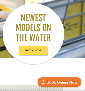
Every page should have a clear call-to-action.
Having book buttons visible on every page will remind customers that online booking is available at any point. Any any point the customer is ready to book, they will know exactly where to click.
We suggest adding a book button in the header and a small “Book online now” link in the footer of the page.
Consider using the FareHarbor buttons stylesheet to add a floating button on every page of your site. This can link straight to FareHarbor booking, or link to a main booking page on your site.
Learn how to add FareHarbor links and embeds to your website.
Lightframe whenever possible.
The Lightframe is the name of our pop-up booking modal that opens on top of the website whenever a book button is clicked. It allows customers to book their activity without ever leaving the client’s website.
Learn more about the Lightframe.
Secure your site with SSL
This one is important. Although the FareHarbor booking process is 100% secure without you adding “SSL” to your website, more and more customers are learning to look for the green https lock at the top of their browser as an indication that they can trust an online merchant. (Plus, it can help you with search engine optimization ranking and page load time.) We’re happy to work with you or your web developer to secure your site. Learn more about security and your website.
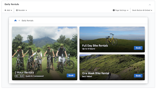
Sell the most popular items first.
For example, if your company offers 10 different activities, but 1 activity accounts for 80% of your bookings, then that item should have more visual prominence on your website than the other 9.
You can also rearrange your Booking Flow(s) in the Dashboard to include the most popular items first and display them as the largest item block.
Provide clear descriptions and beautiful photos of each tour.
Give all the basics – the where, when, and what – so visitors have all the information they need to feel confident in making a booking. Remember, customers don’t know those details that might be obvious to you running your business every day. Things as simple as the length of an activity or making sure folks feel comfortable that they have the necessary skills are often overlooked.
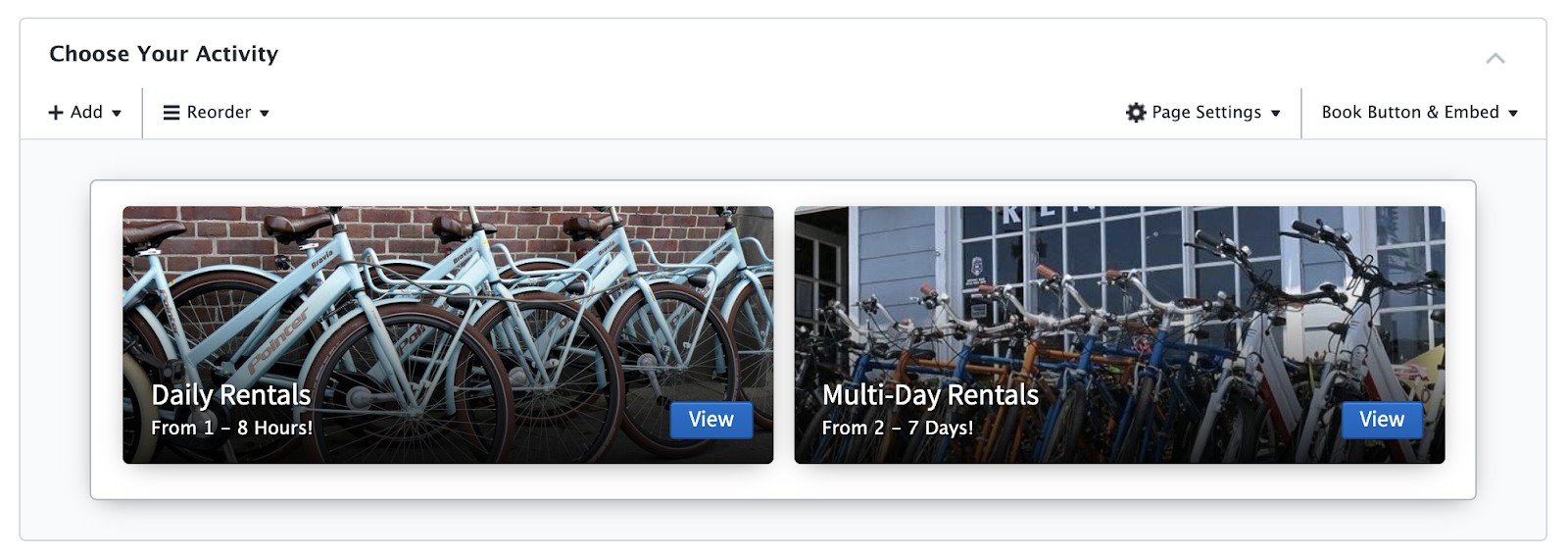
Organize your options.
Create booking flows in your Dashboard to organize your items, and easily insert them into your website where they make the most sense.
For example: if you offer 5 food tours and 3 architecture tours, you could set up two flows: “Food Tours” and “Architecture Tours”, so customers can easily find the activity they want.
Learn more about booking flows.
Don’t overwhelm the user with options.
More buttons on a page doesn’t equal more bookings. Instead of 20 bright red book buttons on the same page, try to include one or two strategically located buttons to help guide customers to checkout.
When presenting several different options to a customer, item grids are usually easier for customers to navigate than a calendar with all of your activities. You can insert an item grid using the embed generator in your FareHarbor Dashboard.
Optimize your site for mobile.
Many of our clients’ websites see over 50% of their site traffic on a mobile browser, and Google is implementing a “Mobile First” policy for SEO. Be sure your integration works on mobile as well. When in doubt, add a fixed button that appears only on the mobile version of the site.