Using the FareHarbor buttons stylesheet with WordPress
Last updated: September 29, 2022
Not using WordPress? See this page instead.
The FareHarbor buttons stylesheet makes it easy to add dynamic, interactive buttons to your website. In contrast to plain text links, buttons provide a clear call to action on a webpage, resulting in more clicks and more bookings.
For information on how to install and use the stylesheet with a WordPress site, click into the sections below.
Installation
If you’re not already using the FareHarbor WordPress Plugin, install it by following the steps outlined on this page.
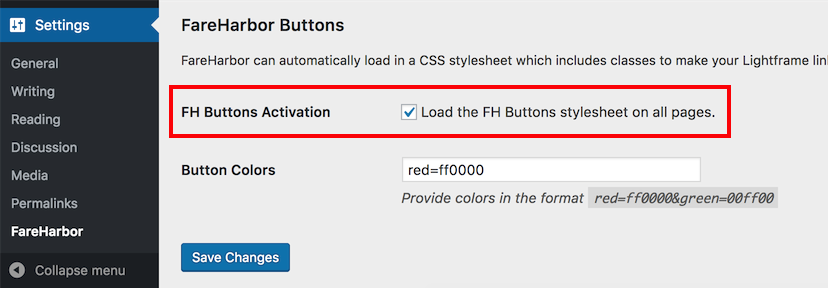
Once the plugin is installed, go to the FareHarbor Plugin Settings and check the box next to FH Buttons Activation. Save your changes.
Color options
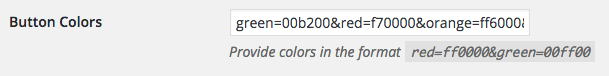
You can customize the color of your buttons by adding “colorname” classes. Add one or more colorname=HEX parameters in the Button Colors section of the FareHarbor Plugin Settings, separated by an ampersand (&).
Example
This button is generated using the below code:
[lightframe class="fh-button-red"]Book Now[/lightframe]
Types of buttons
Once you’ve activated FareHarbor buttons, you can add one of the classes below using the class field in the FareHarbor Plugin Settings. These will be applied to all uses of the [lightframe] shortcode.

You can also add the button classes directly to the [lightframe] shortcode or an <a> tags to turn them into buttons.
Example: [lightframe class="fh-button-2d"]Book Now[/lightframe] or
<a href="" class="fh-button-2d">Book Now</a>
Add -colorname to the end of any of the following classes to change the button to any of your preset color options.
For example use
[lightframe class="fh-button-2d-red"]Book Now[/lightframe] to generate a 2d style button in the color associated with red in the FareHarbor plugin settings.
Button styles are as follows:
Original
The original FareHarbor buttons have a beveled appearance, making them stand out on the page. For original buttons, use class="fh-button".
2D
2D buttons create a bold look, and appear to “pop up” when you hover over them. For 2D buttons, use class="fh-button-2d".
Flat
These buttons work well on websites that have a flatter design. For flat buttons, use class="fh-button-flat".
True-Flat
Stripped of all extra styling, these are the most plain buttons. For true flat buttons, use class="fh-button-true-flat".
Outline
These buttons are clear with a colored outline. For outline buttons, use class="fh-button-outline".
Modifying classes
You can use the below modifier classes to customize your buttons. You only need to declare the button type at the beginning of the string. For example:
[lightframe class="fh-button-2d fh-icon--map"]Book Now[/lightframe]
Tip: Use our interactive FH Kit page to easily generate custom classes for your buttons. Use the dropdowns at the top of the page to customize your buttons, then click on a button to see the automatically generated classes at the bottom of the page.
Icons
Add icons using the classes fh-icon--cal, fh-icon--check, fh-icon--map, fh-icon--gift, fh-icon--arrow, fh-icon--ticket, fh-icon--check-bubble, fh-icon--dollar, fh-icon--clock.
Sizes
The above examples use classes fh-size--small and fh-size--large.
Shape
Give your buttons round or square edges with classes fh-shape--round or fh-shape--square.
Hide on mobile/desktop
If needed, you can use fh-hide--mobile or fh-hide--desktop to hide a button based on whether the user is seeing a mobile or desktop view of the page.
Fixed buttons
When this class is used, a button’s position will be fixed on the page as the user scrolls. See the right side of this page for an example.
Use class fh-fixed--bottom to fix to the bottom right of a page, or class fh-fixed--side to fix to the right side of a page at a 90-degree angle.
Example:
[lightframe class="fh-button-2d fh-icon--cal fh-fixed--side"]Book Now[/lightframe]
On mobile devices, fixed buttons at the bottom of the page will always be centered.